This Is Our Last Year With the MetroCard Machine
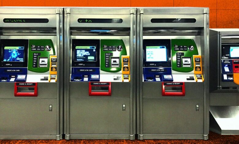
Photo-Illustration: Lined; Photo: Antenna Design
When contacted about the impending disappearance of the imposing stainless steel object found in every New York City subway station since 1999, Paola Antonelli, senior curator for architecture and design at the Museum of Modern Art , called it “my beloved MetroCard machine”. I’m tempted to say she was too expansive, except, it turns out, I feel exactly the same way.
Antonelli included the familiar, everyday machine in “Talk to mea 2011 exhibit on interactive design, much of which was highly speculative and futuristic. When I dig up my review of the show, I find that I had called the big piece of subway infrastructure “utterly adorable.”
Not that I feel love every time I top up my card, a process so quick and frictionless that I normally feel nothing at all. But my affection for the machine sometimes comes to the surface. For example, on my last trip to Washington, DC, my husband and I found ourselves stuck in the Foggy Bottom subway station, bewildered by the DC Metro vending machine. With a bizarre buffet of mechanical buttons and arbitrarily placed instructions, it looked like an artifact from the former Soviet Union. So we had to do the unthinkable: ask an attendant for help.
By comparison, the MetroCard machine has the cheerful allure of a kindergarten color theory lecture. But soon the machine and accompanying bright yellow card will, like the Metro token before it, be history, to be replaced by the OMNY vending machine. A case study from OMNY manufacturer Cubic Transportation Systems estimates that the change, which will begin early next year, will be complete by the end of 2023.
That the MetroCard machine (unlike many aspects of the metro system) elicits beautiful emotions has a lot to do with the exceptionally thoughtful people who designed it. The process, which began in 1996, was spearheaded by industrial designer Masamichi Udagawa, who had just opened the New York office of Palo Alto-based design firm IDEO. The mission: to overhaul a vending machine that the MTA had already decided to purchase, a standard device made by Cubic (the same company responsible for the new OMNY system). Sigi Moeslinger, a designer who had recently left IDEO, joined in the redesign, and by 1997 the couple (partners in business and in life) had formed a new company called Antenna and taken the order with them. They worked closely with a couple of IDEO interaction designers, David Reinfurt and Kathleen Holman, and the MTA’s director of arts and design, Sandra Bloodworth.
Udagawa describes the mission as “disaster management”. The MTA had determined, after extensive testing of the out-of-the-box Cubic machine, that “everyone hated it and couldn’t deal with it.” The problem, according to Udagawa, was that it “was designed by engineers” who didn’t think about how New Yorkers, a huge and hugely diverse group of people, could get their cards quickly and easily.
For one thing, the Cubic machine interface was confusingly “scattered” across the front of the machine. Moreover, in 1996, half of the likely users did not have a bank account and therefore had no experience with the most common touch screens of the time: those of ATMs. And in general, vending machines, especially in the context of the subway system, didn’t have a great track record. The MTA had tried token vending machines in the 1960s and 1980s, but most people preferred the reliability of a gruff token kiosk employee.
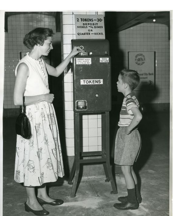
A token vending machine.
Photo: Courtesy of the New York Transit Museum
This situation has given rise to an organizing feature that gives the MetroCard machine its splashy aesthetic. “The multicolored expression was not meant to make the station happier,” Udagawa says. Instead, each color relates to a function. The green area is where you insert money. Blue indicates where the credit cards go. The yellow area is where the machine spits out yellow MetroCards, and the red is for change and receipts. Bloodworth had suggested the scheme since the MTA was painting the same palette (albeit in less vibrant hues) on the station’s columns as part of an ongoing system-wide redesign. (She also helped convince the agency to make the machine’s colored areas, called “bezels,” out of porcelain enamel, making them vandal-proof, hard-wearing, and shinier than anything else in the world. system, even today.)
The most important thing about the design, however, is how the interaction is scripted into discrete steps. “There’s one question per screen and you can’t do anything else,” says Udagawa. Reload an old card or get a new card? Add more time or more value? Use cash or a credit card? A particular challenge in adopting it – remember, this was a decade before the iPhone was launched – was simply getting people to understand that you had to touch the screen to get started. Finally, Moeslinger created an animated finger pointing to the “Start” button. “It made it so obvious,” she says.

The MetroCard start touch screen that shows how to get started.
Illustration: antenna design
Another virtue: the type on the screen is huge — Helvetica Neue bold 54 points. As Reinfurt recalls, they had designed it so that the type and graphics were really chunky, “partly because of our conversations with the Lighthouse for the Blind”. (I never thought of that: as someone who has aged considerably since the machines were first installed 23 years ago, it’s one of the few interfaces I can successfully navigate without my reading glasses.)
In general, the scale of the machine is a registered trademark. As Antonelli recently said over the phone (already speaking in past tense), “You can just use your whole hand to press one of those buttons. It was that kind of ruggedness that I liked. No nonsense It made me think of one of those MTA workers coming out of the tunnels with their orange vests and gloves on. There was something that really looked like New York.

One of the first sketches exploring the color coding of interface elements.
Illustration: Masamichi Udagawa
But I didn’t begin to understand what made this mechanical object so adorable until Udagawa explained to me something he had learned at the Cranbrook Academy of Art in suburban Detroit. At the time, its design department was known for teaching an approach called “product semantics,” which encouraged students to redesign common household objects into expressive, often metaphorical forms. “It was such a departure from the modernist tradition of form follows function,” Udagawa recalls.
While much of what emerged from Cranbrook at this time – like a prototype desk phone that worked like a book and changed function as you turned the pages – was famous in the design world, almost nothing was put into production. It was the design of a future that never really happened. But the whimsical sensuality once celebrated by connoisseurs has survived, hidden in plain sight in a sturdy machine that serves around a billion subway riders a year. For Udagawa, and perhaps other runners as well, it’s this feature that makes the MetroCard machine so lovable – its “subtly anthropomorphic character, with a cheerful face that seems to welcome the customer.”
As Antenna, Udagawa and Moeslinger finished work on the MetroCard machine and continued to design the first check-in kiosks for JetBlue, McDonald’s first self-ordering kiosks (the fast-food company saw a kinship between its MTA customers and ridership), the ticket sales interface for Metro-North and Long Island Rail Road, and the Help Point intercoms now found in subways. They also applied their deceptively modest survey method – We know nothing; we have to learn — the design of several new métro cars, including the R211the one with bright yellow grab bars and bright LED signage, which is currently being tested.
They say they don’t mind not having been involved in the design of the OMNY machines, because the new machines will never be as essential in the lives of subway riders as the MetroCard machines have been. Most New Yorkers will simply use their phone or credit card to pay their fares. You know, that’s life.
Over the next year, New Yorkers may begin to notice the decrease in the number of MetroCard machines. For many, this won’t just feel like the inevitable swapping of old tech for new – like another 4am update to your phone’s operating system – but rather the death of a friend. reliable, the kind we don’t like to think about or fully appreciate until they’re gone.