How to Choose the Right Color Palette for your Home

Nothing is as personal as color. Choosing a color palette is both the most important and the most daunting part for many when it comes to decorating their homes. Read on for great tips as we walk you through creating the color palette that best suits your style, personality, and lifestyle.

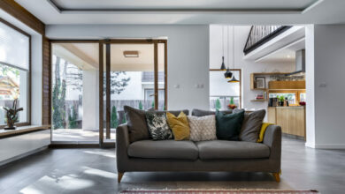
mikehutch40/twenty20
choosing your colors
Start by working from a color wheel. There are primary, secondary and tertiary colors.
[deals-hub-ad]
- The primary colors are red, blue and yellow. They are pure colors and cannot be created.
- The secondary colors are orange, green and purple. These colors are formed when equal parts of 2 primary colors are combined. For example, equal parts yellow and blue make green. As basic as this is this is where we start the color selection.
- Tertiary colors are a mixture, in varying parts, of primary and secondary colors to create different hues, as a result the primary and secondary colors become less vivid. Black and white are often added to darken and soften these tones.

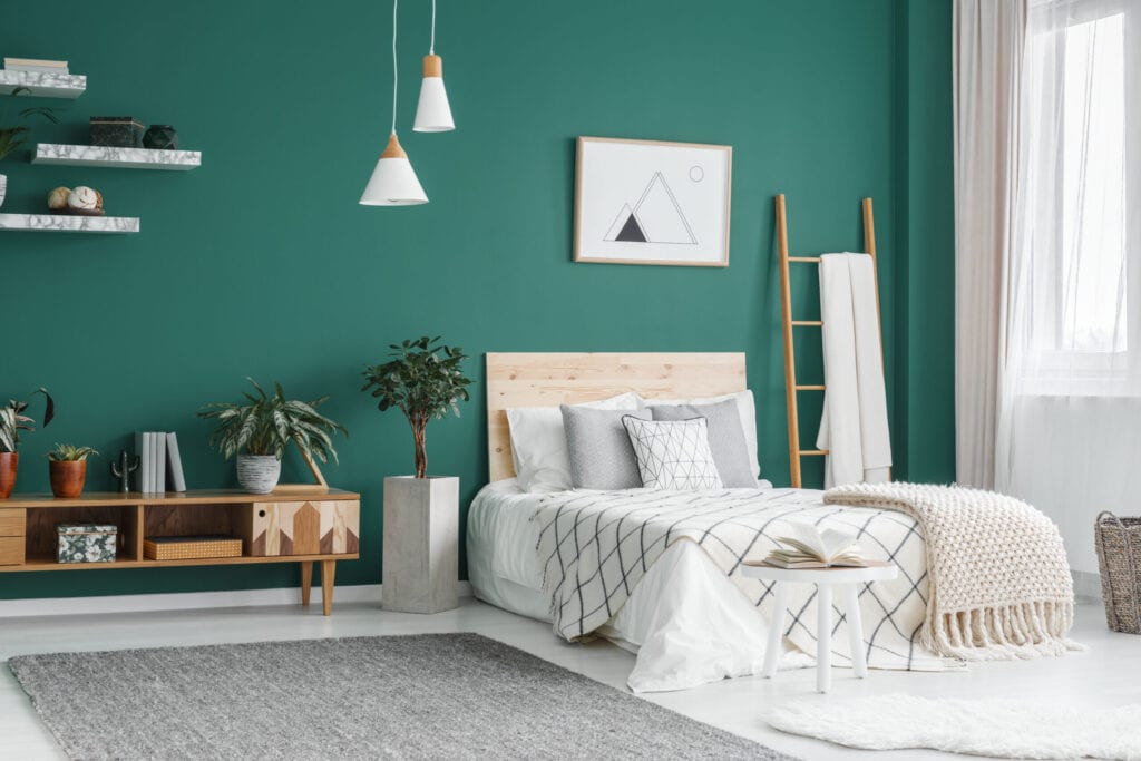
Photographee.eu/Shutterstock
Creating your color scheme
Use your color wheel to help you create your own color scheme that best suits your personality. There are 4 types of possible color combinations.
- Monochrome. The monochrome color scheme uses tone-on-tone of the same color with the addition of black or white to lighten or darken the color. For example, in this scheme, blue can become a pale sky blue or a dark midnight blue and all three shades of the same hue are used to create this effect.
- Analogous. The analogous scheme uses colors that appear next to each other on the color wheel. For example, yellow will be used with green or orange, or blue will be used with green or purple. This creates a colorful and often soothing palette.
- Contrast. The contrast scheme is more dramatic. A triad of contrasting colors is used here, such as yellow-orange, green-blue, and red-purple. This introduces more color and energy into the palette of your home.
- Complementary. Lastly, we have the complementary scheme where two opposing colors such as blue and orange are used together to create a high energy, bold and dramatic color scheme.
Creating your color scheme
We will warn you not to select your wall color first. Wall paints are inexpensive and can be created in any color and shade you like. It’s best to start with harder-to-find items like furniture and rugs or rugs. Once you have selected your furniture, you can move on to the color of the wall. You may decide that you prefer your color not to be on your walls, but in your accessories or furniture. Many people prefer this. Others, on the contrary, prefer more neutral furniture contrasted with bold and powerful walls.
things to consider
Photographee.eu/Shutterstock
When choosing your color palette, you may want to start with contrasts, something dark paired with something light. If you want to infuse a little more color and energy into your room, you may want to consider adding something bright. Where do you want these colors? If you feel more comfortable with pale walls, look at your furniture, accessories, and rugs to add color. When choosing colors, especially the bolder ones, make sure they are sharp and the lines are clean. If your style is more subtle, softer, more neutral tones should be considered.
color tones
Test your colors with paint and fabric samples. Draw plans for your rooms and draw the colors. If they work on paper, try painting small areas of your walls. You can purchase any paint color in a sample size specifically for this reason. When painting sample areas, look at other rooms and how they connect so you can create a flow from room to room so the colors complement each other. An adjoining room may want a neutral or no accent color, or conversely, you can work with contrasting tones as long as there is an appearance of flow.
Turning on
Lighting is an important aspect of all decoration and function within the home and should never be overlooked. Light reflects and deflects color, constantly changing it throughout the day. The most authentic colors in a room are those found during the day, and the tones change throughout the day and the seasons as the lighting changes. Different lighting can also change the appearance of the color. Indigo, for example, can appear bluer in one room and have much more red in another.
Commitment
You love the idea of infusing color into your space, but you’re not really ready to add it to your walls. There are many ways to add splashes of color to your home. If you keep your walls neutral (pale beiges, sands, ivories, grays, and whites), you can add color with rugs, furniture, lamps, pillows, blankets, and artwork, flowers, and fresh fruit. You may also consider painting your ceiling or an accent wall.
where to start with color

kane251/ twenty20
Begin at the beginning. The beginning could be a central room, a foyer or an entrance. Is there a color or set of colors that you particularly like? Do you usually prefer blue, yellow, green? Start with the color that best suits you. Then take that color and look at it several shades and shades lighter and several shades and shades darker. So, for example, on your color wheel, you chose green. You’ve been to the paint store and picked out a dozen or so swatches to paint that are different shades of green. You like two shades, one has more of a gray undertone and one has more of a blue undertone. Perhaps select one shade for the dining room and another for the living room. To make them work together, select a neutral color that can be used in both rooms for the ceiling, trim, or both. Some suggest keeping hallways, landings, and connecting spaces neutral in tone.
Separate the top floor from the bottom floor.

Korneevamaha / Twenty20
Upstairs and downstairs are two separate entities and should be treated as such. It is best to paint your landing or hallway a soft or neutral colour, as often the upstairs is mainly made up of bedrooms which can often have very different colors and contrasts. Children’s rooms are often bright and bold, while guest rooms and home offices are not. If your master bedroom has an attached master bath, you don’t need to paint both rooms the same color, but consider different shades of the same color; maybe paint one room a little lighter than the other. Since the two are connected, there should be some semblance of flow. Choosing the color should be enjoyable and not stressful in the least. Don’t rush into anything. Visit the paint store, talk to the professionals, take home as many samples as you like and hang them all over the house if you like. In the end, these are guidelines to help you, but you don’t need to follow all the rules and guidelines to the letter. Listen to your instinct, trust your instincts: they never lie!